Brand Identity: From Logo Design to a Visual System
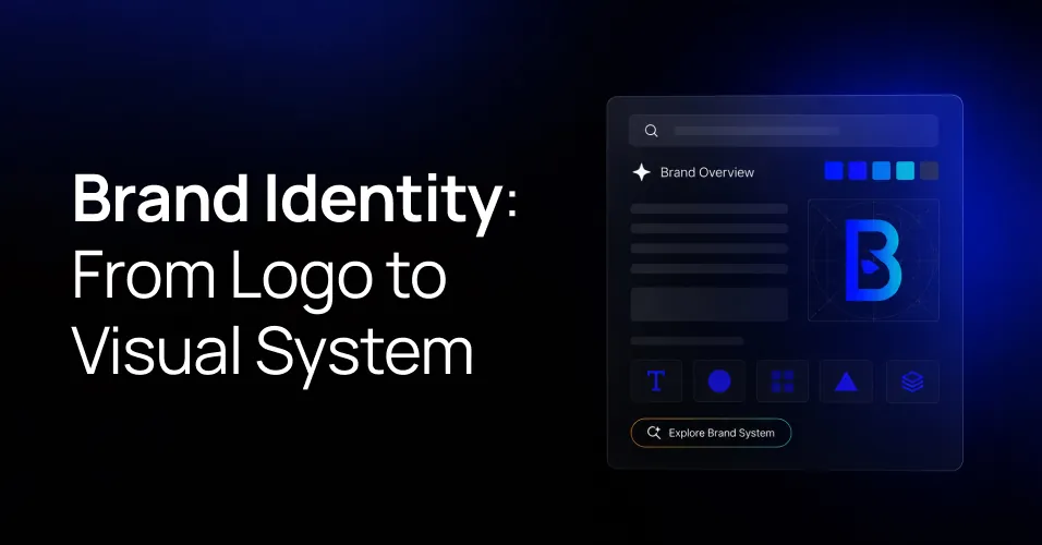
Summary
A logo identifies you. A visual system is what people actually recognise, and it is usually the part that never got built.
- Colour defined by role, not just a palette, with accessible pairings
- A type scale with set sizes and weights for every level
- Spacing rules so gaps feel deliberate rather than improvised
- Logo usage covering clear space, minimum size, and dark backgrounds
- Imagery direction with examples of what is off brand
- Component patterns defined once and reused everywhere
Recognition comes from repetition, so every inconsistency resets the counter. A landing page in a slightly different blue is a page that does not add to the pile.
Write the guidelines for the person assembling a deck at 6pm, not for an awards submission, and start with the touchpoints you actually ship.
Most brand projects start with someone asking for a logo. Six months later the same business has a logo, eleven shades of blue, three fonts nobody agreed on, and social posts that look like they came from different companies.
The logo was never the problem. The system around it was missing.
A Logo Is an Identifier, Not an Identity
A logo does one job. It marks something as yours. It cannot carry tone, hierarchy, or personality on its own, and it is usually the smallest element on any page it appears on.
What people actually recognise is the whole picture. The colour they see before they read anything. The way your headings feel. The spacing that makes your site feel calm or cramped.
What a Visual System Contains
A working identity gives your team enough to make decisions without asking. At minimum that means:
- Colour with roles. Not just a palette, but which colour is primary, which is for actions, which is for warnings, and what the accessible pairings are.
- A type scale. Defined sizes and weights for headings, body, and small text, so nobody eyeballs it per page.
- Spacing rules. A consistent scale so gaps feel deliberate rather than improvised.
- Logo usage. Clear space, minimum sizes, and what happens on dark backgrounds.
- Imagery direction. What your photography and illustration should feel like, with examples of what is off brand.
- Component patterns. Buttons, cards, and forms defined once and reused everywhere.
Consistency Is the Whole Point
Recognition comes from repetition. Someone needs to see the same colour, the same type, and the same tone several times before it registers as yours.
Every inconsistency resets that counter. A landing page in a different blue is not a small thing. It is a page that does not add to the pile.
Make It Usable by People Who Are Not Designers
A 90 page brand book that lives in a drive folder does nothing. A one page reference with the hex codes, the font names, and five examples of right and wrong will get used every week.
Write it for the person putting together a deck at 6pm, not for the design award submission.
Build It in the Order You Will Use It
Start with the touchpoints you actually ship. Website, deck, social, email. Get those consistent and the rest follows. Extending a system that works is easy. Rescuing one that was never used is not.