The Psychology Behind Effective Graphic Design
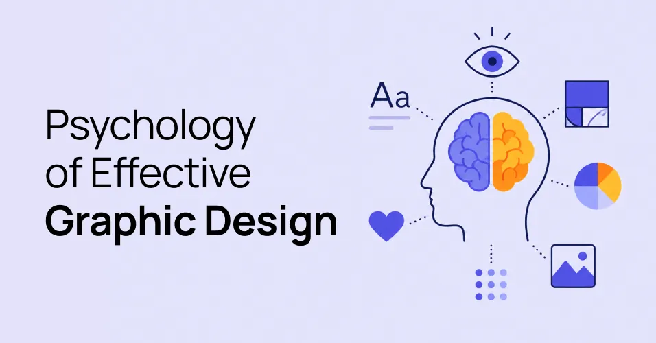
Summary
Graphic design decides where someone looks and how they feel about it before they have read a word. Most of that happens below conscious thought, which is why it works.
- Structure is read before content, so hierarchy carries the first meaning
- Colour signals urgency, safety, and tone before any words are processed
- Typeface, weight, and line length change how a message sounds
- Familiar patterns reduce effort, and breaking them costs attention
- First impressions form in a fraction of a second and colour everything after
A cluttered layout feels stressful even when every element in it is well made, because equal emphasis tells people that nothing in particular matters.
Decide what someone should notice first, then use size, colour, space, and type to make that true.
Good graphic design is not decoration with better taste. It is a set of decisions about where someone looks, what they notice first, and how they feel about it before they have read a word.
Most of that happens below conscious thought, which is exactly why it works.
People See Structure Before Content
Before anyone reads your headline they have already taken in the shape of the page. Big things read as important. Things grouped together read as related. Things with space around them read as separate.
This is why a cluttered layout feels stressful even when every individual element is well made. The structure is telling people that everything matters equally, which is the same as telling them nothing does.
Colour Carries Meaning Before Words Do
Colour sets expectation. Red is read as urgent or wrong. Green is read as safe or complete. A muted palette reads as serious, a saturated one as energetic.
The mistake is treating colour as branding only. In an interface it is also information. If your primary action, your links, and your error messages are all the same colour, you have removed the signal.
Type Sets the Voice
Two pieces of identical copy in different typefaces are not the same message. Weight, letter spacing, and line height change how confident, how formal, and how easy to read the text feels.
Line length matters more than most people expect. Somewhere around 60 to 75 characters per line keeps people reading. Much wider and the eye loses its place returning to the left margin.
Familiar Patterns Reduce Effort
People arrive carrying every interface they have ever used. A logo top left goes home. An underlined phrase is a link. A magnifying glass is search.
Breaking those patterns costs attention. Sometimes that cost is worth paying for something genuinely better. Usually it is not, and the novelty just makes the product harder to use.
The First Impression Sticks
Research on visual appeal consistently finds that people form an aesthetic judgement of a page in a fraction of a second, and that judgement colours how they rate everything afterwards, including how well the thing works.
That is not an argument for style over substance. It is an argument that looking considered is part of being trusted.
Use It Deliberately
None of this is manipulation. It is the difference between a page that makes people work and a page that gets out of the way. Decide what someone should notice first, then use size, colour, space, and type to make that true.