Mobile App Design · Event Management Agency
Discovery That Feels Like a Night Out
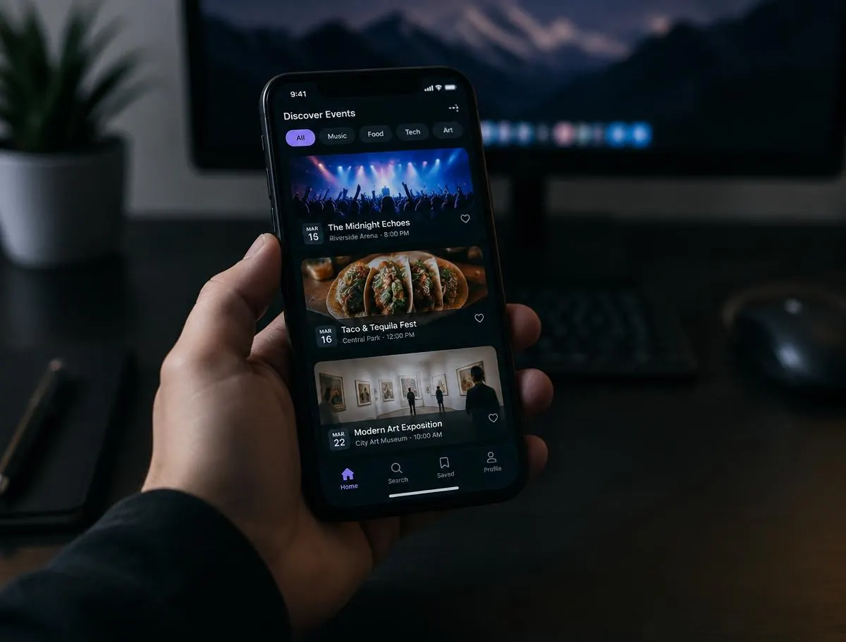
A city events platform needed a mobile app people open out of habit. We designed a dark, image-led feed built around fast discovery and one-tap saving.
- Industry
- Events
- Role
- Mobile UX & UI
- Duration
- 10 weeks
- Platform
- iOS & Android
Project overview
Plenty of Listings, Little Delight
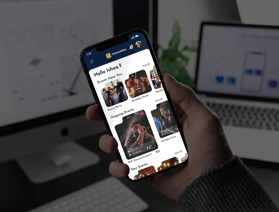
The existing app held thousands of events but presented them as a flat, text-heavy list nobody scrolled twice.
The problem
Choice paralysis
No filtering by mood, budget, or distance.
Weak visuals
Event imagery was cropped to irrelevance.
No return hook
Nothing encouraged a second session.
The goal
Make browsing enjoyable
A feed that rewards scrolling rather than punishing it.
Decide in two taps
Save, share, and buy without leaving the card.
Work in the dark
Most sessions happen at night, so the theme follows.
Our process
Six steps, one clear line.
- Research
- Flows
- Wireframe
- Interface
- Prototype
- Handoff
UX process
Designing for Spontaneous Plans
People decide late and together. The app is built for fast filtering and easy sharing into a group chat.
Decision 01
Tonight first
Time-sensitive events surface at the top of the feed.
Decision 02
Visual categories
Music, food, art, and tech identified at a glance.
Decision 03
Shareable cards
Every listing exports as a clean, readable preview.
UI design & key screens
Dark, image-led, built for tonight.
Final outcome
Numbers that moved.
- +92%
- Weekly active users
- +58%
- Saved events
- 2.7x
- Session length
- +44%
- Ticket click-through
“People use it now instead of asking in the group chat. That's the whole product goal.”
Leila Hoffmann — Product Lead, Event Posting App
More case studies