Property Tax Relief Agency
Helping Property Owners Reduce Their Tax Burden
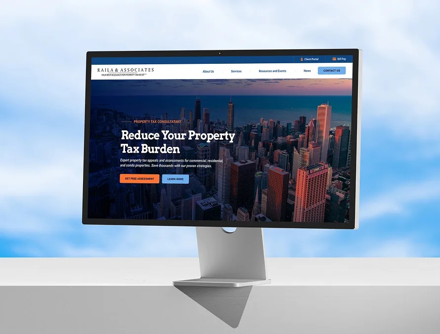
A trusted tax relief firm with two decades of results was losing enquiries to a dated website. We rebuilt the experience around clarity, proof, and one obvious next step.
- Industry
- Property Tax Relief
- Scope
- UX, UI, Design System
- Timeline
- 9 weeks
- Platform
- Responsive Web
Project overview
Trusted Brand, Dated Experience
The firm had the reputation and the results — but the website did not show it. Visitors could not tell what the process involved or how to begin.
Hidden proof
Two decades of successful appeals sat buried below the fold, invisible to first-time visitors.
Unclear path
No single, confident call to action meant enquiries leaked out at every scroll depth.
Mobile friction
More than half of visitors arrived on a phone and met a layout built only for desktop.
The challenge
What challenges were we solving?
Complex information, plainly told
Tax appeal language had to become something a homeowner could scan in thirty seconds.
Two very different audiences
Residential owners and commercial portfolios needed separate but equally direct routes.
Credibility without clutter
Proof points, credentials, and outcomes had to earn trust without crowding the page.
Understanding the audience
Designing for Property Owners
We interviewed recent clients and mapped the moments where confidence was won or lost, then designed the page order around that sequence.
Lead with the outcome
The saving, not the service description, became the first thing a visitor reads.
Qualify in one step
A short eligibility prompt replaced a long contact form as the primary action.
Answer before they ask
Fees, timelines, and what happens next were brought forward into the main flow.
Our process
Six steps, one clear line.
- Research
- Structure
- Wireframe
- Interface
- Prototype
- Handoff
Wireframes
Structure before style.
Desktop wireframe
Mobile wireframe
The solution
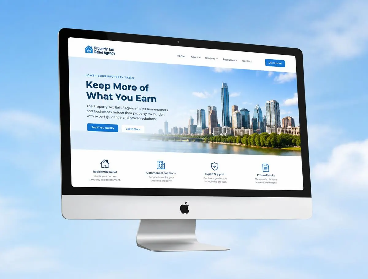
The final experience.
Desktop Homepage
The saving, not the service description, became the first thing a visitor reads.
Mobile Experience
A short eligibility prompt replaced a long contact form as the primary action.
Responsive showcase
Every screen, considered.
Results
Numbers that moved.
+82%
Qualified enquiries
+46%
Mobile conversion
38%
Lower bounce rate
2.3x
Time on key pages
“The UI/UX Expert team didn't just make the site look better — they made it easier for clients to understand what we do. The enquiries we get now are far better qualified.”
Marcus Raila
Managing Partner, Raila & Associates
More case studies
Explore more of our work.
Let's build your next digital experience.
Tell us about your project and a designer will reply within one business day.